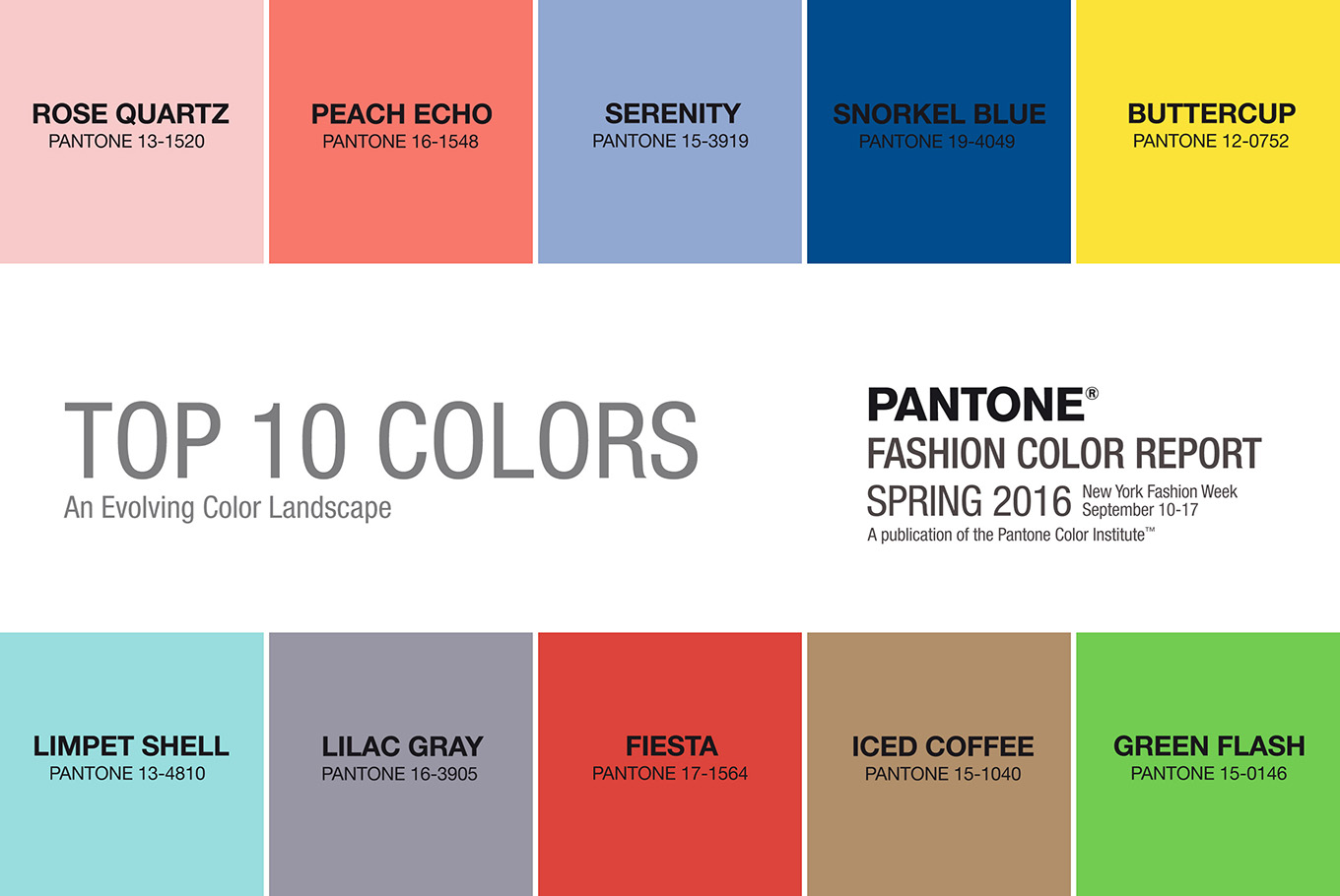
With spring just around the corner and warmer days ahead, most of us are are already thinking of how to wear the pantone colors of 2016 and can’t wait to incorporate the Pantone colors and emerging trends of 2016 into our wardrobes but it might not always be easy to pull off our favorite runway looks. Some colors make lighter skin tones seem too pale while others won’t compliment darker skin tones as nicely. Working with your skin tone rather than against it can help you make sure that the color scheme you are wearing is the best one to accentuate your features. Let’s have a look at the must-wear colors for this spring and see which ones work best for every skin tone.
How To Wear The Pantone Colors Of 2016 According To Your Skin Tone
Fair or Pale Skin
If your skin is pale and you have blonde, light brown or red hair it’s recommended that you wear bolder shades in order to add some color to your overall appearance. Dark tones such as burgundy, navy blue, brown or gray and bolder colors can contrast well with your skin but warm pastels should be avoided since they can make you seem paler. This spring’s Snorkel Blue is an ideal choice for fair skin but if you’re not naturally rosy-cheeked the fiery Fiesta variation of red can also be a great option for you. The peach echo Pantone color is of course, majestic and stunning, for most skin colors, including the fair one, and it’s our favorite pick if we had to choose.
Medium or Olive Skin
If you have a medium skin tone or olive skin the best thing to do is to choose shades that are either lighter or darker than the regular color, so as to avoid the medium color. Either choose bolder tones for dark colors or pale light neutrals that you can accessorize, just don’t get stuck with the basic shade of the color. This spring you can play with the Iced Coffee brown that’s easy to pair with a stylish work bag or the lovely romantic Rose Quartz and Serenity. The lilac grey shade would also work wonderfully, even as a new hair style (bold, we know).
Darker Skin
Darker skin tones usually work well with most colors but there are still some stunning shades that really make a darker skin tone shine. As darker skin is very versatile and can pull off a wide variety of shades and colors (lucky you!) we can count some especially flattering options to take into account from this spring’s pantone colors. The Buttercup yellow will certainly look stunning on darker skin tones and the Green Flash is an equally great but bolder alternative. The Limpet Shell, difficult to pull off with paler skin tones, will in fact work wonders for you not unlike the Serenity and the warm Peach Echo is bound to be equally stunning but warmer. Just look at how great the model Nana Afua Antwi looks in serenity and peach, right below.
That being said, don’t restrain yourself from wearing your favorite color just because you think it may not look good with your skin tone. These rules and directions; how to wear the pantone colors of 2016 should be taken as loose guidelines, and not as (further) reasons to limit your style, when we are already put down by advertising and the fashion industry the way we are. If you choose to wear a Pantone color which you like, but you think may not suit your skin tone ideally, shift the focus and balance with a contrasting accessory like a scarf or necklace and all should be fine!
Photo Sources: 1 || 2 || 3 || 4
If you enjoyed reading this post – how to wear the pantone colors of 2016, you might enjoy reading the previous post about Pantone colors on this blog.
Shop Pantone 2016 Colors
Remember to follow this blog
A fashion student who lives by Yves Saint-Laurent’s words ‘Fashions fade, style is eternal’. Her pursuit is helping women find the best outfits for their personality and body type, instead of following trends.
She loves to take long walks and look at urban outfits (with a critical eye!) and indulge in her golfing passion on weekends.